Wednesday, 6 September 2017

Trip to Alton Towers

During the early weeks of the summer holidays, after my trip to Tenerife. Me and three friends visited the theme park, Alton Towers, which all in all was stressful but amazing!

We began with queuing for our first ride which was called Nemesis. As you can see I was photographing the ride whilst we were waiting to get on it and trying as best I could to create shots from several different angles in order to capture every movement possible. Whilst doing this I realised just how satisfying the flowing shapes of the rollercoaster was, especially with it being so curvaceous which means it relates massively to one of artists I am currently studying called named Maggi Hambling who focuses on crashing and rolling wave movements.


 This ride didn't just provide amazing loops and deathly highs but also an unbelievable animation side. Large alien inspired arty decorations were moulded to the exterior of the rollercoaster. I found the textures, colours and techniques of this creation so intriguing, I wanted to photograph it in much more detail but the line was moving fast. Although this doesn't relate to many of my artists really, I though it was so interesting and I now want to look into alien forms because with inspiration from these photographs I think I could create some really eye catching compositions.


The experience of this ride its self was absolutely amazing! After this we wanted to visit the other side of the park and to do that you could take a ride on the cable carts but the queue was ridiculously big, therefore we took a little detour...


There was an optional route where we were able to follow the red signs in order to get to the other side of the park which I really enjoyed as it provided me with oppositional perception of the park and showed me what else it had to offer as well as proving that it had the ability to be suitable for people of all ages, and interests.

One of my favourite things about these pictures is that most of the surrounding areas haven't been messed or tampered with and it shows a more rural environment even within the most man made of sites. The first photograph I have provided shows a large white structure, this build was currently in the process of being improved and converted but we weren't informed as to what the final outcome is going to be. Despite this, I thought that it had quite a spooky abandoned circus type of vibe which lead on from the scary alien abduction from the previous ride, giving an overall Halloween aura which really intrigues me.

Reaching the end of this exploration, we arrived back in the main section of the park, and whilst we were searching for our next ride I couldn't help but notice the beautiful lakes and the wildlife that it held inside.


 There was a gorgeous family of ducks, as well as a few floating around independently. Although I wasn't able to get up very close for a picture, I really love the photograph on the right here with the duck alone because the contrast is so perfect and balanced also the surrounds and slight ripples of the water creates so much elegance for the duck. Despite these pictures having a different theme to the rest, they haver still really inspired me, and I could also think about combining the two.

 Once we had admired the outstanding nature, we carried on around to see what the rest of the park had to offer;


One of the things that stood out to me the most must have been the exquisite buildings, although they were freshly painted in bright colours, they have an authentic feel about them which adds to the feel of an alternative fairy fantasy world. The also provided a sea life centre area as well as smaller game stalls rather than just large rides which made the park more appealing to children.

Also on our travels we came across something which definitely makes me want to revisit this theme park next summer. This reason is one I didn't expect to spot.


It was a brand new build occurring! We had no idea what was being constructed here but as you can see from this picture, what is already built looks similar to the structure of a roller coaster. Through research I have found that the last new roller coaster released was in April 2016 called Galactia and the theme park have not yet broadcasted a new ride.

Finally on our way back to the car park when all the fun was over, we took the sky high train to the area where our vehicle was parked. This wasn't just an ordinary train, it was completely covered in a jelly bean pattern;


The reason that this pattern is so significant is because it relates back to something I have mentioned in a previous blog post...

Before, I made this similarity between the photograph and the experiment I had created, we had a class discussion about each of our photographs and during this, one of my peers suggested that the pebbles could also look similar to a collection of multi-coloured sweets such as skittles or jelly beans.
The photo of the train is now an eye opener because I was able to see in real life what a collection of sweets would look like, now I could move on to photographing the sweets myself in real life.

The day was over but by far my favourite thing to photograph throughout were the things that people don't really tend to pay much attention too;


I think these pictures are the best and by far the most interesting, especially with the rust and cob wedded areas.


Wednesday, 9 August 2017

My weekend away in Tenerife


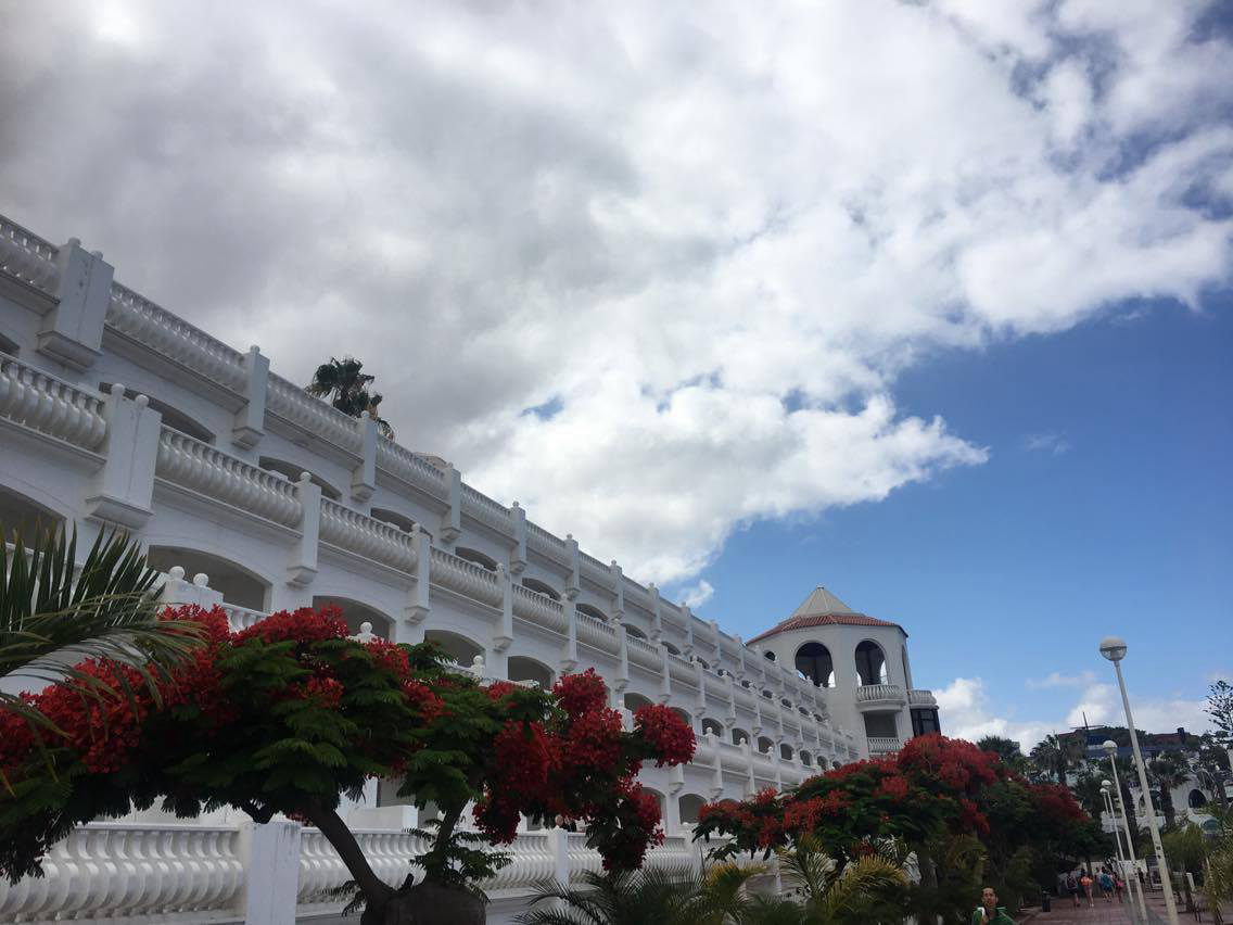
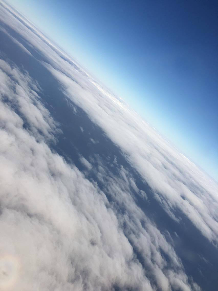
On the 16th of June 2017, I boarded the plane during the early hours of the morning and set off on my long weekend away to Tenerife for my cousins 50th birthday celebrations. It was so exciting for me because it was essentially my first girly holiday! The plane journey was really important in terms of my art work because the gradual progression through the sky provided hundreds of different cloud movements and luckily we flew during daylight therefore everything was clear and visible. Here are just a few of my favourite images.

Below the clouds, shortly after take off

Above thick cloud cover showing shadows of the plane, also massive relevance to my art work

reaching just above the clouds with a splitting movement starting to occur

completely above, birds eye view

reformation of cloud cover 

My favourite view of the entire flight, a beautiful ombre effect between bright white cloud and deep blue sky

Beneath the clouds, heading down towards the island - also helpful for my art work as it shows ocean structure and colour as well as some of the sea crashing against the shore to create wave movements
Add caption

Finally, this photograph was taken only minutes before landing on the island. I really loved this angle as it created a dollhouse effect on the villages, making everything so minuscule.

When we arrived, we then got a mini bus to our hotel (Laguna Park 1) we had about 4 rooms between us with 4 people in each. Me and my mum shared a room with my 2nd cousins who we don't see very often, this was so nice as we ended up growing really close with them and we all had our final lunch together at a restaurant over looking the sea.
During our first day of the holiday, we spent a few hours round the pool then we ventured out of the hotel and went exploring, we walked through the local town and went in a few different shops first.


During the walk I also tried to look at aspects that would reflect my art and my artists, the main one I focused on during this time was Justin Gaffrey because I noticed that there were lots of beautiful flowers and greenery which throughout this artists work is mainly the most important aspect.


The main piece of Gaffrey's work that I had in mind whilst taking these photographs was this one as it contains large amounts of flowers in the foreground then a landscape background behind it. the most relevant photograph of mine to this painting is the second one down on the left because that image includes a close up of large red flowers similar to the ones in Gaffrey's composition.

After this walk, we finally visited the beach which was definitely my favourite part as I got to start looking closer in to my third artist, Maggi Hambling, as well as still taking note of factors that might show importance for my other artists. firstly I focused on taking landscape pictures as we entered the beach by walking on a peer like platform 

still incorporates main features of Scott Naismith's style due to cloud structure and colour upon water, although there isn't much light movement.


 combining both Maggi Hambling and Scott Naismith as this one involves more wave movements.


This one reminded me of Justin Gaffrey again because it contains rocks and trees in the foreground with a sky as the background.

After this we actually went down onto the beach and I notices that every beach has black sand and the reason for that is because it is the result of volcanic basaltic coastline eroded by the sea. Despite this not having much to do with any of my artists, I found it really interesting myself which could contribute to a personal aspect of my work. 

These two images above show the movement of waves as they crash upon the shore which is the closest I'm able to get to the structure and detail behind Maggi Hambling's work. This is the main part when my love for the black sand comes in because as you can see, specifically in the first picture, the sand merges with the bright white crash of the wave creating a darker deeper look which makes the wave look more structured and sinister. 

This is a much more close up photograph of the wave. I have also tried to do it at a lower angle, my reason for this is to try and make the wave look much bigger than it actually is. My next step into bettering this is to purchase a water proof camera or a 'Go Pro'. Therefore I would be able to get right underneath and even create footage as I go through the wave.

This is my fourth favourite image that I have picked out from a large section of photographs I took, I love this one because not only are waves being created, but they are crashing upon the rocks which enhances the intensity of the wave because the pressure is much higher when the water hits them than it would be for sand.

The next big event we attended was during the night time, 80's night! We did this as a surprise for my Cousin and provided her with a George Michael outfit to dress up in.


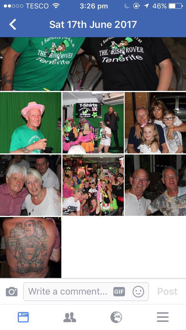
We all went around the local town and made our way through the karaoke bars until we came to one that was coincidentally presenting an all 80's night! The bar was completely dead until we turned up and as a thankyou they uploaded a photograph of us onto their Facebook page.


Then we all got the picture printed onto a key ring each which stuck into my travel book, along with my name badge.


We didn't do much during the other days except enjoy time with each other around the pool as the sun finally decided to come out after two days of solid cloud cover. It was really nice as the hotel was lovely as well.
 During our final night in Tenerife we paid to have a private Italian meal together and finally got to dress up in own clothes, then we flew back the next day during the night time.


Saturday, 5 August 2017

My experience of the KEGS final art show


During the week of show preparation, we were cleaning up the studio and beginning to hang up pieces on the wall and display compositions. The installations of be pieces really made me start to consider how I could express my work in diverse ways such as my favorite one is hanging objects from the sealing beneath a projecting sealing lights, I think that positioning my work this way would give more a more personal feel to the audience as they would be able to really get up close and observe all angles of the composition. If I did look more into this type of installation it could persuade me to create something more three dimensional or even just to use both the front & back of my canvas. One piece that I did notice that is slightly different to the one I've mentioned but still along those lines is this one;


I love the fact that this artist has used the corner of the room because it shows they've used the space wisely and managed to create their own area which is more eye catching for audiences. They also incorporated their sketchbook into the instillation which when I flicked through, was full of several experiments that all seemed to slowly build up into the final piece presented.

Another piece of work which is by far my favourite, isn't the most exaggerated of installations but it has a really interesting background and the drawings are so intricate and accurate which I think shows lots of talent and skill, therefore I would like to portray some similar aspects with in my own work. I would also like to look in to a similar subject like this one as I think that insects are really interesting and I have drew them in my past GCSE work.


The final piece that really caught my eye goes back to my liking in hanging instillations as this one is attached by string from the ceiling. But the main reason I really love this work is because of it's interesting meaning that you have to look slightly deep in to find, this is good because it makes the audience work hard in order to understand what the artist is trying to portray. The picture doesn't show this very well but if you look closely it consists of a women laying in fields with her natural body hair enhanced and the statement above basically reinforces the importance of women's natural aspects and how they should be embraced.


Throughout the show one each out our first-year work was presented which was really lovely because we had all worked really hard on our final pieces. Although I wasn't able to attend the show, my friends went and Kindly sent me photographs, like one of mine which was positioned at a low part of the wall.

Although my interests were mainly focused on the big framed work and installation pieces I wish I had looked more closely at the sketchbooks and put my attention to the smaller compositions that were involved in the build up to the larger final piece because the process is just as important as the outcome.
Analysing Peers work (finding the meaning)

During this lesson we looked at each others work that was up on the wall in pairs and tried to unpick a meaning that we thought was relevant. Firstly we chose one of Callum's compositions which contained a photograph of a vicious looking leopard overlapped upon the face of a human. We thought that the distressed, dark colours over this vibrant animals face could suggest the suppressant of ones fiery personality due to them being put in a depressing, intimidating and dominated situation such as an abusive relationship. To support this we thought that the movement of the slanted photograph along with brush strokes that crated claw like marks, implies that this person is trying to escape from the entrapment. Further supporting this is the colour scheme of a dark photograph background corresponding with the bright white strokes drawn over it, this is significant because it could show the position they are in - currently in the darkness and hopelessly reaching towards the light at the end of the tunnel. In conclusion I think this composition demonstrates a desperate cry for help.
Here are some images of the process in which we all pinned up our own pieces in a place that we thought was most suitable to emphasise colours, textures or meanings.


Callum's composition wasn't the only one we evaluated, we also talked about Chelsea's work in my pair, which is pointed out in the photo above as the higher up one. And below that is one of Callum's pieces that I've previously spoken about.

Chelsea's piece, as you can see from the picture is very different to Callum's. It involves a collection of much lighter tones which gives it a brighter vibe. Due to this we found it much harder to discover a meaning behind the work because there wasn't much diversity or contrast, despite this we managed to figure out somethings, for example, in the centre there is a section that's thicker and has been stuck over to tip of the original canvas which we thought could imply that there is something hidden behind or it's there to cover up a secret of some kind which gives an element of mystery about the composition. As well as this, because the colours are quite bright and neutral, it gives off a feel of earthy tones which could suggest a representation of nature but despite this the palette doesn't have a specific highlight which I think would really improve the overall piece.