Canvas Work
During the past two weeks I have moved forward so much in terms of scale, surface variation, paint textures, techniques and quantities. As you can see previously throughout my blog, I have only ever really used paper in my sketch books therefore I thought it was time to venture out of my comfort zone. I began using different woods, boards and canvas'.
One I had gathered a large range of canvas' and boards, I began to prep them all with a very think layer of white emulsion paint, in order to cover up anything underneath and brighten the colours to be applied on top.

After
this process I started applying the first layer of the background. For this I
tried to use inspiration from some of the first experiments that I had
completed in my sketchbook, as I wanted to keep this layer nice and simple in
terms of colour and mark movement. I wanted to do this so that the composition didn't look too cluttered once more paint is added.


After this I added some texture and colour to the pieces.


Once this was done and dry I mixed the acrylic
paints that I had been using purely, with PVA glue which created a gooey, more
liquidised consistency in order to create a top layer. I wanted to create this type of mixture so that I could pour and drip the paint, which acrylic alone was unable to do. These colours were much more
vibrant against the standard hues of the background which added contrast, and to
add further contrast, the PVA with paint created a shinny finish against the
matte background.


This one was inspiration from several of my experiments because I found that blue and orange worked best together therefore I was guaranteed of a composition that contained complimenting colours.


On
this particular composition I got a comment from Amelia about how it showed
similarities of an upcoming artist who publishes his work through social medias
much as Instagram therefore I followed him in order to gain further inspiration
as I thought his work was really interesting.

After beginning this we took a trip to Manchester where we visited the Whitworth Gallery. This is one of the best galleries I have ever visited as the artwork was much more contemporary rather than old fashioned therefore it contained more abstract expressionism which is the field I'm exploring.
I documented this trip within my travel book, talking about a few of my favourite compositions and installations as well demonstrating a few drawing skills and incorporating a range of leaflet I'd collected.


 From looking at my small A5 blue and orange colour schemed canvas I noticed that I had unintentionally created bubbles throughout the top layer of PVA glue and acrylic mixed. I thought this worked really well because it almost adds yet another layer to my work and not only this but it perfectly represents textures of lava flow which relates directly back to my Fogo Island volcanic eruption concept.
 Another thing I also found really intriguing was how pure acrylic dried amongst the acrylic that had been diluted by PVA glue. Yet again I really liked this and want to keep using it as it shows both the strong pigment of the acrylic itself and the areas mixed with PVA add a slightly transparent element therefore being able to grasp glimpses of the mark making underneath. Not only this, but the transparency aspect creates a link with the technique I acquired using acrylic dipped in water which also created a see-through appearance.


Here I added a bright yellow and PVA glue mixture on top of the red acrylic background created using a squeegee. Looking at this piece from a far I realise that I should've added much more of the yellow which I could actually do now that this piece is dry as it would add more layers.


I documented this trip within my travel book, talking about a few of my favourite compositions and installations as well demonstrating a few drawing skills and incorporating a range of leaflet I'd collected.


After this trip I began looking back at my canvas work and assessing how they looked once dry.


This was one piece that I wasn't so keen on once dry because due to the texture on the surface of the board, the PVA layer was supposed to perform as gloopy and smooth and shinny. Where as here you can see it dried to look much rougher and showed an imprint of the surface. One way that I could possibly solve with issue is do yet another layer on top of the dry PVA to see if the thickness would decrease the lumpy appearance. Other than this I could resort back to simply using smooth canvas only rather than board.
This was exactly what I did, continued on to use purely canvas. Also I tried to use as much paint as possible to make sure this previous incident didn't happen again. My plan for these next canvas' was the hang them all on the wall as a joining piece and create colours that drip through each one (like the flow of lava would).

Here I added a bright yellow and PVA glue mixture on top of the red acrylic background created using a squeegee. Looking at this piece from a far I realise that I should've added much more of the yellow which I could actually do now that this piece is dry as it would add more layers.

This piece definitely has slightly more of the top coat than the previous one but still, it could do with slightly more. I think the contrast on this composition is better because both the blue of the background the red dripping effect are bright and pigmented which is helped by the mix of white emulsion within the blue squeegee marks.


Here is my least favourite and least contrasting piece of them all. Both the colours dried a dark and dingy colour leaving texture as the only contrasting element. I don't actually think this looks bad because the marks are expressive and consistent but I just wouldn't use these colours together again. I think this experience has what made me shy away from darker shades and go on to use almost fluorescent hues.


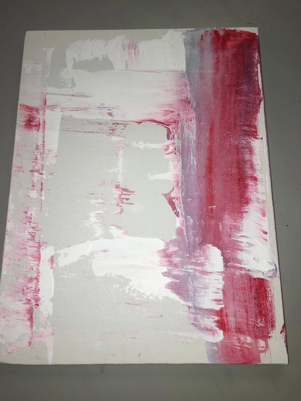
One of my favourite background demonstrations so far, due to the way blue and pink show themselves as separate colours yet sometimes combine to create a completely different shade of purple.

Here is a photograph of them all together as I intended. Looking at them now I wish I had put them all together first before putting the top coat one rather than painting them all individually.


Here are some close up shots of how I attempted to intertwiningly link each of the canvas' together. I tried to interlock to colours to show how one was merging into the other with a smooth motion.
No comments:
Post a Comment