Saturday, 8 July 2017


Artist Analysis- Maggi Hambling

Maggi Hambling is a British contemporary painter and sculptor. Although my focus on this artist is her painted pieces, some of her most famous work is also sculpture. More specifically, the ‘Scallop’ and ‘a conversation with Oscar Wilde’. Although both are extremely figurative which I am not specifically interested in this year which is why I am sticking to studying her paintings instead.

Wave crashing, Oil on canvas, 2009, 30 × 41cm

  Wave returning, Oil on canvas, 2009, 152 × 244cm


Hambling uses oil paint on canvas but throughout her other pieces of work she also uses, charcoal, ink and monotype on paper as well as plaster, bronze, granite, war coffin (which is a small, rough sand-cast bronze sculpture with some areas of paint patina applied to it. It contains a horizontal coffin shaped frame which are attached to four upright structures on each corner, then connected to two parallel parts below) and also stainless steel but she only uses these materials when creating sculptures, despite this I still want to experiment with them as I could use them to build up texture on top of paintings.


Some work that I have already completed based on this artist is a mind map which I have created in order to link each artist through several aspects in order to discover what part of each artist will be best to focus on. During this I have written about how difficult it will be to make similar pieces to Hambling’s work due to her paintings being based on wave movements. Due to the fact that we live in area where the Ocean is over 100 miles away, it wouldn’t be an easy task for me to get down there in the period of a storm which is when Hambling would create her pieces because of the dramatic waves produced by the weather. Despite this I did visit Wales during the bank holiday Monday meaning I was able to photograph as much relatable content as possible which included several different shots of small waves crashing on the shore, taking more than one photograph ensured that I could capture as much movement as possible.

Below is the best of the images I took, I think these show the best movement of before, during and after the crashing of the wave.


Within these photos my main focus is the flash of white which is produced when the wave crashes, this is the part that demonstrates most movement in the wave because it looks rough and aggressive, I could replicate this effect by gathering textured materials and surfaces that I could build on top of, such as mount board and homemade paper.
Another piece of work I completed on this artist was an experiment sheet using different mediums, I got the same outcome as when I used these materials for my other artist (Scott Naismith) in that the best ones were the materials which provided texture, although they didn’t have such good blending ability which meant the painting looked more unrealistic and neat. Although this may seem a downfall with the materials, Maggi Hambling does produce some expressive compositions that don’t encounter much realism. But also (especially in Hambling’s work) a rough effect needs to be made in order to create more movement.
One way that I think I could begin work using this artist is by using a collaberation of my own photos and Hambling’s work and building on to them to form texture but also keeping in the curvatious form of the wave at the same time.
My favourite and most varied work I’ve completed on the bases of this artist is during class with three materials; fine liner, pencil and charcoal.


my drawings went on, they became rougher and more elegant due to me loosening my grip on the charcoal, this would really well in terms of creating sharp fast movement but during this I began to lose the curvaceous shape of the wave which is really important to maintain.


As development for this mark making exercise, I have recently created a composition that has more personal aspects such as inspiration from photographs which I have taken on a previous holiday to Wales and a trip to Leicester. These drawings and Maggi Hambling’s work came into this piece throughout the centre where a curvaceous shape is formed. The reason I did this was to create a break between the busy outer edges of the board and it also demonstrates the crazy and unpredictable the human mind is.
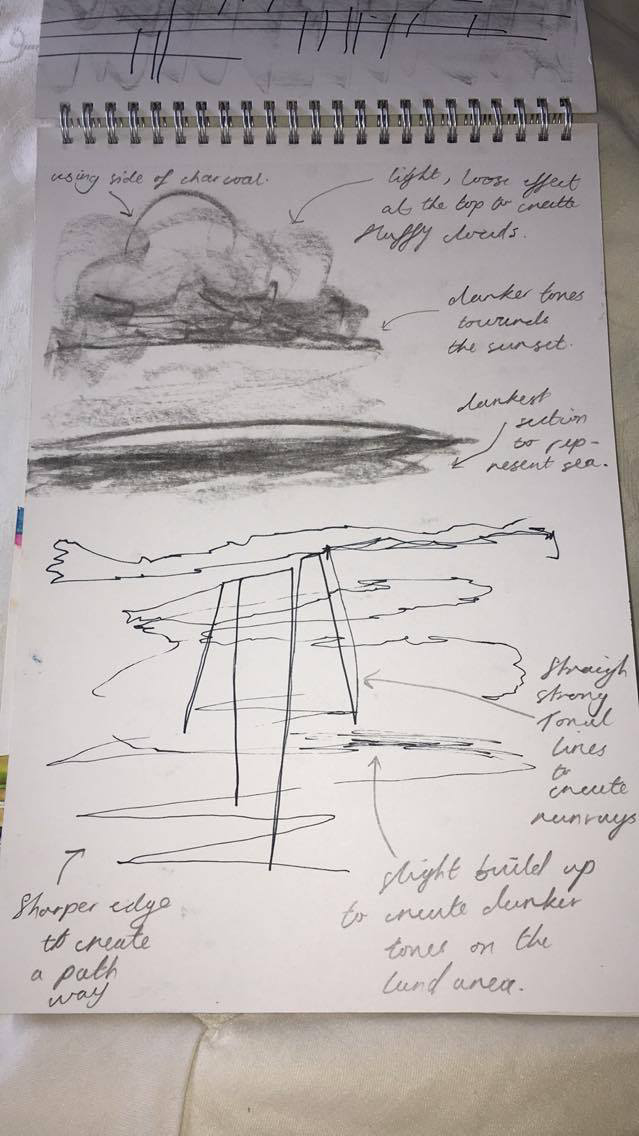


Tuesday, 27 June 2017


Artist Analysis- Scott Naismith

Scott Naismith is a Scottish Landscape painter who works from his Studio in Glasgow. Naismith’s most recent work consists of lots of concentration on several vivid colours breaking through dark gloomy clouds. This expression was no accident, it connotates a metaphor of hope and new beginnings due to hos fathers recovery from cancer and the birth of his children.
Example that I find more interesting which I found from pinterest and are not titled even in further research that I have done:


Naismith uses oil paint on canvas, with two main tools, palette knives and brushes. His work consists of layering vigorous applications of bright colours. This is done to represent the fast-changing light sequences within the sunset/rise.

After ten years of painting Naismith now focuses on the effect of light through thick cloud cover with the use of translucent and opaque properties. He is much more interested in monitoring movement from heavy overcast to a clear bright sky. Throughout his autobiography, he also states that during the build up to his career he has several inspirations such as Turner, Nicolas de Stael and Samuel Peploe.

The picture above is an example of J.M.W Turner’s work, titled “Fishermen at sea” created in 1796 and was the first oil painting exhibited by Turner in the Royal Academy. I think that it is really similar to Scott Naismith’s composition called West Coast Blues 2 shown on the right. The reason that I think these pieces look like each other is because of the use of dark sky with only a small section of light in the middle which reflects to create a shimmer on the Ocean.
Nicolas de Stael’s work consists of a blurred build-up of shapes, mainly oblongs. The piece below on the right is one I find most relatable and interesting in terms of Scott Naismith’s work. I think this because during this composition De Stael creates a series of multi angled four sided shapes in order to form a brick built look, with each block varying in colour but still sticking to a general colour scheme of white, orange/brown, black and blue throughout. Naismith uses this technique in his West Coast Blue 3 piece when he uses simple block work in order to create a build-up of rocks and varied tone in sea.


The last artist that Naismith relates to is Samuel Peploe, the most relatable piece that I could find within my research was the image below called A Rocky Shore, lona. I think this is where Naismith has adapted his most realistic compositions as Peploe involves more detail. The layering of paint is more delicate and accurate so the landscape is easily recognisable, similar to Naismith’s Resonance piece as you can tell he uses small individual brush strokes in order to create a textured surface.


Since Naismith is such a contemporary artist I was able to find out that his newest pieces of work were only displayed last year on the 7th of May and are still currently on show at Morningside Gallery in Edinburgh, which makes it possible for me to actually visit and take my own photographs in order to get a better perspective of the size and texture of his work.
Although it will be difficult for me as I don’t live very near to any beaches or seas, and we rarely have any colourful sunsets/rises, I have attempted to capture a few of the most colourful skies as the seasons are changing.


Although these pictures aren’t as colourful as Naismith’s, there is still contrast on some of them, especially the far right with the dark grey cloud over the yellow glowing sky. Obviously, the biggest problem being that there are no seas beneath these skies but luckily next weekend I am going down to Wales with my family. This means I will have plenty of time to photograph the sea which cou

ld also be helpful in terms of my other artists; Maggi Hambling and Justin Geffrey, as their work also consists of sea movements.

One place I have already visited is Herbert Art Gallery and Museum, this was a very successful trip and I managed to get it down to five main pieces that I liked, one of them was very similar to Naismith in the idea of technique, application and medium use. This is because this artist also uses oil paint, with a paintbrush and layers thick to create good texture. This artist is called John Bratby and this is an example of his work called Christmas Eve, Christmas Day and Boxing Day.
I haven’t yet done much work on this artist as most of it has just consisted of research but recently in class we have been doing several practices in group work and sometimes involving a foundation student. These sessions consisted of testing our ability to use different mediums in different ways and in the style of our chosen artists work in order to try and understand the way in which they work. This first piece on the right is from observing one of Naismith’s pieces and has actually been created upside down in order to see the effects of it when turned back round, I found this rather difficult yet interesting because drawing upside down made it hard to maintain the proportion and judgment of the sky against the Ocean.


Another one is this one below which I did with my eyes closed and continuous line. This one is landscape which I found much more effective as Naismith also paints this way sometimes. Other than this I’m not really keen on it as I think it looks messy and dull due to the use of pencil, this medium is especially unrepresentative as Naismith’s work is all about bring vibrant colours, however it does create a smooth, soft effect which runs throughout his work specifically when creating light clouds.


This next one is, I think, the best because not only is there a variation in medium with charcoal, pencil and fine liner, but also the cloud effect at the top of the page is done well with a slight smudging effect to create a fluffy look. The drawing at the bottom of the page links to a piece of his newest work with the light rays shining through from dark overcast, I also created this one within a brief time limit.

This last page I created myself at home. It is simply a series of experiments on a page using water colour, gouache, acrylic and pencil crayon. Next I want to try oil paint. I found that the best ones were watercolour, gouache and acrylic. Although the watercolour lacked texture, the acrylic and the gouache was difficult to blend and the pencil crayon didn’t have much pigment within the colours so they weren’t very vibrant like Scott Naismith’s.

Thursday, 15 June 2017

Modernism


Modernism is a philosophical movement that, along with cultural trends and changes, emerged from transformations in Western society during the late 19th and early 20th centuries.
Modernism is the creativities of those who believed that the traditional art techniques, etc. did not correspond correctly with the modern life they were living.


https://en.wikipedia.org/wiki/Modernism


Postmodernism


Postmodernism is the development that occurred with in the mid- to late 20th century. It is a time period where anything available was used in order to for an expressive composition, these resources were mainly from the past.


https://en.wikipedia.org/wiki/Postmodernism


In art, postmodernism was specifically a reaction against modernism which had dominated art theory and practice since the beginning of the twentieth century. The term postmodernism is also widely used to describe challenges and changes to established structures and belief systems that took place in Western society and culture from the 1960s onwards.


http://www.tate.org.uk/art/art-terms/p/postmodernism


Sandro Chia, ‘Water Bearer’ 1981Water Bearer
1981

Artist
Sandro Chia born 1946
Medium
Oil paint and pastel on canvas
Dimensions
Support: 2065 x 1700 mm


Most of Sandro Chia's paintings during this era were rative human shapes carrying out startling actions. The artist said that is specific piece I have displayed about was "his first chance of illustration of classical sculpture. Through his work he worked with animals and humans through association. Although, her general subject is mainly men or boys travelling to an unknown destination that we never seem to discover.


My photography - the best bits


Tuesday, 6 June 2017

Installation artists including digital manipulations

Cornelia Parker, ‘Cold Dark Matter: An Exploded View’ 1991
' The term installation art is used to describe large-scale, mixed-media constructions, often designed for a specific place or for a temporary period of time.


Artist-
Cornelia Parker born 1956

Medium-
Wood, metal, plastic, ceramic, paper, textile and wire

Dimensions-
Unconfirmed: 4000 x 5000 x 5000 mm


This composition uses objects to symbolise transience and fragility, it is made of familiar domestic items that are created from the explosion. The whole space is turned into a sculptural environment due to the shadows that have been made by the presence of the damaged objects. This artist take influence from war, specifically from the British Army, as this is an exploded garden shed.


http://www.tate.org.uk/art/art-terms/i/installation-art


Cerith Wyn Evans   
Forms in space ... by light
This collection is made from almost 2km of neon lighting, which has been configured into straight lines, sweeping curves and spiralling forms, and hung from the ceiling.
OperArt [work 530] – “Forms in Space… by Light (in Time)” di ...
He has expanded his practice to incorporate sculpture, photography, film and text to communicate his influences from language and perception. He uses a wide range of illumination in his compositions which display theatrical atmospheres.


My Manipulated Photographs-


I took the photo above when I visited Leicester town during half term, I thought that the light shinning through the window was really interesting because the structure of the glass creates strong shadows. By using instagram I was able to use structure to emphasise the bold marks created on the inside of the building and this picture also provides a section of clouds in the sky which relates to two of my three artists.  

This photo is also one I took during the Leicester trip although it involves a lot more focus on the sky which I have enhanced by increasing saturation to accentuate the colour which is used mainly by Justin Gaffrey when he uses extremely bright mediums.


This photograph was originally taken in the morning so it was quite bright and a typical bright yellow colour but to ensure that a sunset type of look was created I increased pink tones as well as saturation and contrast to make the trees appear as a black shadow.

This picture was taken whilst I visited Wales as I really needed an image which was relevant to my artist Maggi Hambling therefore wave movements were most appropriate, by editing it I was able to increase structure, decrease brightness and add shadows which ensured that the waves had a rough, sharp edge to make them look storm like.


This photo was taking walking home from a pub on a sunny evening with my family and because we were walking with the sun behind us I was able to create shadows against the grass and objects.


I also have other ones that I have manipulated using materials that aren't digitally applied, such as charcoal, newspaper, fine liner and pencil. These mediums were good for defining edges that the printer hadn't focused on enough.

Friday, 5 May 2017

Introduction


This is my personal investigation, which I have built up on the basis of three things; my personal favourite aspects of colour, line, etc. as well as the 3 artists I have chosen (which incorporate my favourite aspects into their work) and also, what I have learnt from completing a project in my first year e.g. technique and efficiency.

Although last year I included some sections of colour in my year 1 work, there was still a massive quantity of black and white texture-less drawings, which I want to completely go against in my component 1 project, therefore I have chosen these following artists:

Maggi Hambling, this artist creates a variety of different pieces, from charcoal drawings, to sculptures of bronze and heavy bodies oil paintings, mainly of wave movements (which I am mainly focusing on). I have completed small amounts of work on this artist such as, experiments, artist analysis and a collection of photographs similar to her work. Also me and peers have collaborated in group discussion and come up with several ways I could progress with this artist, such as creating a build up of materials on top of a photograph, one way I could prevent the materials for interfering with each other is by using a layer of acetate for every medium. Also if I was to focus specifically on waves, I would record crashing wave sounds myself and do a  response from them buy creating blind drawing with nothing to guide me except the soundtrack. As well as this I could use under water photography of the wave in order to get a completely different perspective of it or stand inside the wave whilst it is breaking.

Scott Naismith is another interesting artists that I am studying, his work also incorporates the sea but a much calmer version with his main focus on the fast changing light movements in the sky. He creates less of a variety and sticks more to his landscape oil on canvas pieces. I have also gathered photographs and experiments in the inspiration of Naismith's work but I have more ideas such as using untreated canvas so that the colours run into each other and merge together, this would be so good to create a smooth blended look. Another idea I could do on top of this is by adding neon paint as a highlight in a limited which would also be so effective in term of the reflection on the water. One medium which I want to experiment with and I think would be really good is chalk because it's so easy to manipulate.

Justin Gaffrey, my final artist and my newest one. The reason I chose this artist so late is because I originally chose a different but then realised that I didn't want to focus on photography during component one which is what that artist used. Also Gaffrey is a good combination of my favourite aspects of all of my artists work; texture, colour, subject. Due to him being a new artist to my subject I haven't completed much work on him but my peers gave me loads so inspiration such as using either my fingers, a palette knife or card board. I thought this was a really good idea because through doing my other experiments I realised a lot of the paint was wasted in the brush where as my fingers or a palette knife wouldn't absorb the medium therefore I could add more paint and create more texture.
One last idea that combines all three artists is to apply texture of Maggi Hambling's work as a background, then overlay the softness of Scott Naismith on a transparent material such acetate and incorporate the detail of Justin Gaffrey.