My weekend away in Tenerife
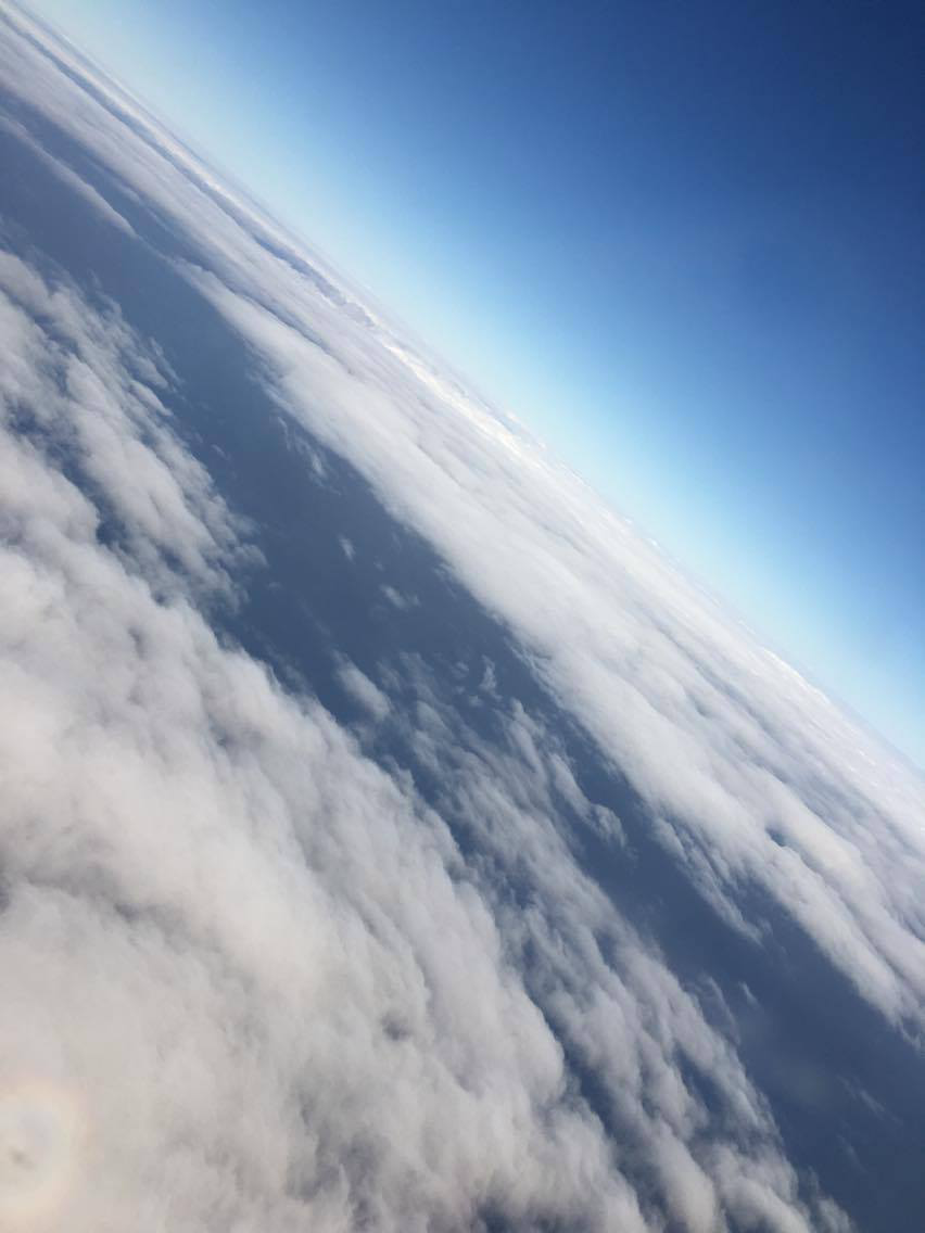
On the 16th of June 2017, I boarded the plane during the early hours of the morning and set off on my long weekend away to Tenerife for my cousins 50th birthday celebrations. It was so exciting for me because it was essentially my first girly holiday! The plane journey was really important in terms of my art work because the gradual progression through the sky provided hundreds of different cloud movements and luckily we flew during daylight therefore everything was clear and visible. Here are just a few of my favourite images.

 This is my fourth favourite image that I have picked out from a large section of photographs I took, I love this one because not only are waves being created, but they are crashing upon the rocks which enhances the intensity of the wave because the pressure is much higher when the water hits them than it would be for sand.
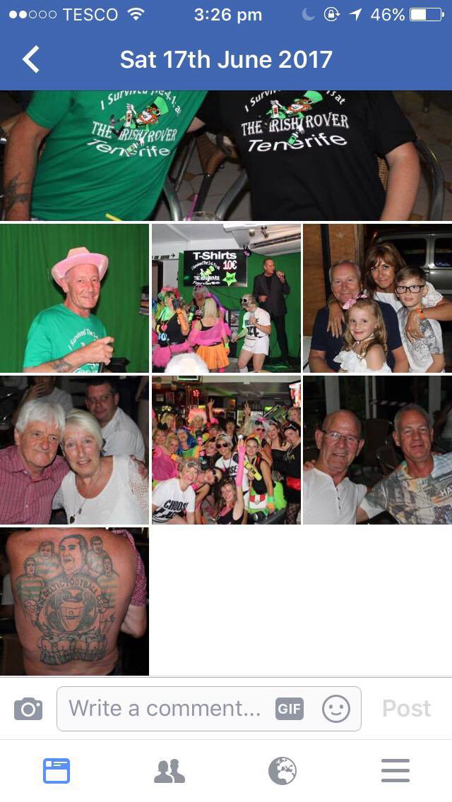
The next big event we attended was during the night time, 80's night! We did this as a surprise for my Cousin and provided her with a George Michael outfit to dress up in.
We all went around the local town and made our way through the karaoke bars until we came to one that was coincidentally presenting an all 80's night! The bar was completely dead until we turned up and as a thankyou they uploaded a photograph of us onto their Facebook page.
Then we all got the picture printed onto a key ring each which stuck into my travel book, along with my name badge.


 |
| Below the clouds, shortly after take off |
 |
| Above thick cloud cover showing shadows of the plane, also massive relevance to my art work |
 |
| reaching just above the clouds with a splitting movement starting to occur |
 |
| completely above, birds eye view |
 |
| reformation of cloud cover |
 |
| My favourite view of the entire flight, a beautiful ombre effect between bright white cloud and deep blue sky |
 |
| Beneath the clouds, heading down towards the island - also helpful for my art work as it shows ocean structure and colour as well as some of the sea crashing against the shore to create wave movements |
 |
| Add caption |
 |
Finally, this photograph was taken only minutes before landing on the island. I really loved this angle as it created a dollhouse effect on the villages, making everything so minuscule.
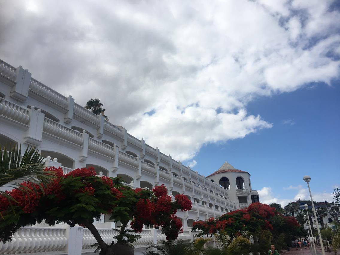
When we arrived, we then got a mini bus to our hotel (Laguna Park 1) we had about 4 rooms between us with 4 people in each. Me and my mum shared a room with my 2nd cousins who we don't see very often, this was so nice as we ended up growing really close with them and we all had our final lunch together at a restaurant over looking the sea.

During our first day of the holiday, we spent a few hours round the pool then we ventured out of the hotel and went exploring, we walked through the local town and went in a few different shops first.
    
During the walk I also tried to look at aspects that would reflect my art and my artists, the main one I focused on during this time was Justin Gaffrey because I noticed that there were lots of beautiful flowers and greenery which throughout this artists work is mainly the most important aspect.
   The main piece of Gaffrey's work that I had in mind whilst taking these photographs was this one as it contains large amounts of flowers in the foreground then a landscape background behind it. the most relevant photograph of mine to this painting is the second one down on the left because that image includes a close up of large red flowers similar to the ones in Gaffrey's composition. 
After this walk, we finally visited the beach which was definitely my favourite part as I got to start looking closer in to my third artist, Maggi Hambling, as well as still taking note of factors that might show importance for my other artists. firstly I focused on taking landscape pictures as we entered the beach by walking on a peer like platform

still incorporates main features of Scott Naismith's style due to cloud structure and colour upon water, although there isn't much light movement.
   
This one reminded me of Justin Gaffrey again because it contains rocks and trees in the foreground with a sky as the background.
After this we actually went down onto the beach and I notices that every beach has black sand and the reason for that is because it is the result of volcanic basaltic coastline eroded by the sea. Despite this not having much to do with any of my artists, I found it really interesting myself which could contribute to a personal aspect of my work.
|


These two images above show the movement of waves as they crash upon the shore which is the closest I'm able to get to the structure and detail behind Maggi Hambling's work. This is the main part when my love for the black sand comes in because as you can see, specifically in the first picture, the sand merges with the bright white crash of the wave creating a darker deeper look which makes the wave look more structured and sinister.

This is a much more close up photograph of the wave. I have also tried to do it at a lower angle, my reason for this is to try and make the wave look much bigger than it actually is. My next step into bettering this is to purchase a water proof camera or a 'Go Pro'. Therefore I would be able to get right underneath and even create footage as I go through the wave.

The next big event we attended was during the night time, 80's night! We did this as a surprise for my Cousin and provided her with a George Michael outfit to dress up in.


We all went around the local town and made our way through the karaoke bars until we came to one that was coincidentally presenting an all 80's night! The bar was completely dead until we turned up and as a thankyou they uploaded a photograph of us onto their Facebook page.

Then we all got the picture printed onto a key ring each which stuck into my travel book, along with my name badge.

We didn't do much during the other days except enjoy time with each other around the pool as the sun finally decided to come out after two days of solid cloud cover. It was really nice as the hotel was lovely as well.

During our final night in Tenerife we paid to have a private Italian meal together and finally got to dress up in own clothes, then we flew back the next day during the night time.


