Artist Analysis- Scott Naismith
Scott Naismith is
a Scottish Landscape painter who works from his Studio in Glasgow. Naismith’s
most recent work consists of lots of concentration on several vivid colours
breaking through dark gloomy clouds. This expression was no accident, it
connotates a metaphor of hope and new beginnings due to hos fathers recovery
from cancer and the birth of his children.
Example that I find
more interesting which I found from pinterest and are not titled even in
further research that I have done:


Naismith uses oil paint on canvas,
with two main tools, palette knives and brushes. His work consists of layering vigorous
applications of bright colours. This is done to represent the fast-changing
light sequences within the sunset/rise.
After ten years of painting
Naismith now focuses on the effect of light through thick cloud cover with the
use of translucent and opaque properties. He is much more interested in
monitoring movement from heavy overcast to a clear bright sky. Throughout his autobiography,
he also states that during the build up to his career he has several
inspirations such as Turner, Nicolas de Stael and Samuel
Peploe.

The picture above is an example of
J.M.W Turner’s work, titled “Fishermen at sea” created in 1796 and was the
first oil painting exhibited by Turner in the Royal Academy. I think that it is
really similar to Scott Naismith’s composition called West Coast Blues 2 shown
on the right. The reason that I think these pieces look like each other is
because of the use of dark sky with only a small section of light in the middle
which reflects to create a shimmer on the Ocean.

Nicolas de Stael’s work consists of
a blurred build-up of shapes, mainly oblongs. The piece below on the right is
one I find most relatable and interesting in terms of Scott Naismith’s work. I
think this because during this composition De Stael creates a series of multi
angled four sided shapes in order to form a brick built look, with each block
varying in colour but still sticking to a general colour scheme of white,
orange/brown, black and blue throughout. Naismith uses this technique in his
West Coast Blue 3 piece when he uses simple block work in order to create a
build-up of rocks and varied tone in sea.


The last artist that Naismith
relates to is Samuel Peploe, the most relatable piece that I could find within my
research was the image below called A Rocky Shore, lona. I think this is where
Naismith has adapted his most realistic compositions as Peploe involves more
detail. The layering of paint is more delicate and accurate so the landscape is
easily recognisable, similar to Naismith’s Resonance piece as you can tell he
uses small individual brush strokes in order to create a textured surface.


Since Naismith is such a
contemporary artist I was able to find out that his newest pieces of work were
only displayed last year on the 7th of May and are still currently on
show at Morningside Gallery in Edinburgh, which makes it possible for me to
actually visit and take my own photographs in order to get a better perspective
of the size and texture of his work.
Although it will be difficult for
me as I don’t live very near to any beaches or seas, and we rarely have any
colourful sunsets/rises, I have attempted to capture a few of the most
colourful skies as the seasons are changing.


Although these pictures aren’t as
colourful as Naismith’s, there is still contrast on some of them, especially
the far right with the dark grey cloud over the yellow glowing sky. Obviously,
the biggest problem being that there are no seas beneath these skies but
luckily next weekend I am going down to Wales with my family. This means I will
have plenty of time to photograph the sea which cou
ld also be helpful in terms of my other artists; Maggi Hambling and Justin Geffrey, as their work also consists of sea movements.
One place I have already visited is
Herbert Art Gallery and Museum, this was a very successful trip and I managed
to get it down to five main pieces that I liked, one of them was very similar
to Naismith in the idea of technique, application and medium use. This is
because this artist also uses oil paint, with a paintbrush and layers thick to
create good texture. This artist is called John Bratby and this is an example
of his work called Christmas Eve, Christmas Day and Boxing Day.


I
haven’t yet done much work on this artist as most of it has just consisted of
research but recently in class we have been doing several practices in group
work and sometimes involving a foundation student. These sessions consisted of
testing our ability to use different mediums in different ways and in the style
of our chosen artists work in order to try and understand the way in which they
work. This first piece on the right is from observing one of Naismith’s pieces
and has actually been created upside down in order to see the effects of it
when turned back round, I found this rather difficult yet interesting because
drawing upside down made it hard to maintain the proportion and judgment of the
sky against the Ocean.

Another one is this one below which
I did with my eyes closed and continuous line. This one is landscape which I
found much more effective as Naismith also paints this way sometimes. Other
than this I’m not really keen on it as I think it looks messy and dull due to
the use of pencil, this medium is especially unrepresentative as Naismith’s
work is all about bring vibrant colours, however it does create a smooth, soft
effect which runs throughout his work specifically when creating light clouds.

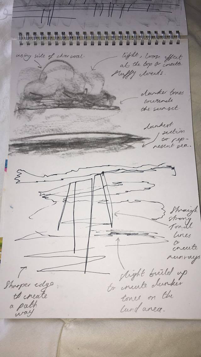
This next one is, I think, the best because not only is there
a variation in medium with charcoal, pencil and fine liner, but also the cloud
effect at the top of the page is done well with a slight smudging effect to
create a fluffy look. The drawing at the bottom of the page links to a piece of
his newest work with the light rays shining through from dark overcast, I also
created this one within a brief time limit.


 This
last page I created myself at home. It is simply a series of experiments on a
page using water colour, gouache, acrylic and pencil crayon. Next I want to try
oil paint. I found that the best ones were watercolour, gouache and acrylic.
Although the watercolour lacked texture, the acrylic and the gouache was
difficult to blend and the pencil crayon didn’t have much pigment within the
colours so they weren’t very vibrant like Scott Naismith’s.
This
last page I created myself at home. It is simply a series of experiments on a
page using water colour, gouache, acrylic and pencil crayon. Next I want to try
oil paint. I found that the best ones were watercolour, gouache and acrylic.
Although the watercolour lacked texture, the acrylic and the gouache was
difficult to blend and the pencil crayon didn’t have much pigment within the
colours so they weren’t very vibrant like Scott Naismith’s.


![OperArt [work 530] – “Forms in Space… by Light (in Time)” di ...](https://barbarapicci.files.wordpress.com/2017/04/forms-in-spacee280a6-by-light-in-time-by-cerith-wyn-evans-2.jpg?w=640&h=482)


